

 |
| A Cate Myers design |
When BeWrite Books sent me this cover for approval, way back in 2005, for my first novel Death in Malta, I fell in love with it at once. My fans loved it too, and this first novel has been a nice steady success ever since. Sometimes, a cover and the content of a novel just click together, and readers sense this.
 |
| A Tony Szmuk design |
When BeWrite Books sent me the cover for According to Luke earlier this year I was not immediately convinced. It took me a while to see the genius of Tony Szmuk's design. Ever since the book was released, I have received any number of compliments about the novel's appearance. People praise its appropriate 'puzzle' suggestion, and the background that indicates the watery location of Venice.
It's far from easy to design a book cover. Designers are visual people - and they rarely have time to read a whole novel in order to conjure the image that might interpret and promote it best. By the same token, authors are 'word' people who rarely understand visual prompts as well as those trained to understand what makes people love a cover. Or better still, makes them buy a book because they like the cover.
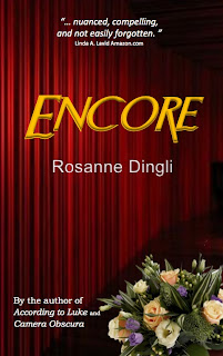 |
| A Rosanne Dingli design |
To come up with what you see, it took me a fortnight of playing around with concepts, images, words and colours. I am not the fastest person on earth to make a decision, let alone the two dozen or so selections one must make to create a cover. The process was slow and deliberate this time. The opinions of a number of groups and individuals were taken into account. Now the little book is out, and I hope will gladden me with the approval of a whole lot of happy gift-buyers this Christmas.
Your opinion is required: What do you think of the covers of all my books? These are only three ... there are several more, which can be seen on my website.
A candid opinion is a rare thing - I would like as many as you can muster. Leave one or two in a comment box for me.


I really like the cover to Encore, Rosanne, but not, I'm afraid the other two. I'd never even noticed the watery baciground, and the door in beige on beige seems rather static.
ReplyDeleteSo I guess I prefer your style to that of your publisher. Good luck with Encore!
Rosanne, I'm sure I have already expressed my liking for your covers. They are completely individual, tasteful and pleasing as images in themselves. Why, I'd hang a few posters of them myself, if my study wasn't already plastered with my own! margaretsutherland.com
ReplyDeleteI like them, Roseanne, though I wonder if the rubic's cube is relevant - which I can't judge without reading the book. I like the door because it suggests the hint of something behind the door, a mystery to be opened. I like the curtains for the same reason - it's like an invitation to watch or observe. Of the three I prefer Enceore, which is a testament to your own design skills.
ReplyDeleteYou're so right to blog about covers. I know from personal experience how a bad cover can impact on sales. I like all your covers, but I think that the Death in Malta one is the least striking and eye catching and easy to miss in a bookshop - it doesn't hint at the story or make me wonder about what is behind it. Both According to Luke and Encore are fresh and vivid and certainly attract my attention.
ReplyDeleteWe all grew up with the ideal of "don't judge a book by its cover", however we all do but we just don't like to admit it.
ReplyDeleteI like to say that I pre-judge a book by its cover. I know which books to pick up off the shelf by the cover, the snippet in the back sells me on it.
http://www.ManOfLaBook.com
Rosanne, I totally get the "puzzle" thing and the water and such. My only caveat would be ... since you spoke of fonts, etc ... is that your name ... YOUR BRAND! is almost invisible. Covers are shown in such small sized on most sites, especially amazon ... Could it be made more prominent? To a certain extent the Title also could be made ... I don't know BIGGER. Ok, I admit it, I want REALLY BIG titles and author names. Submitted with the best of intentions as always ... love your art work!
ReplyDeleteI always liked the cover of According to Luke.It hints at what the novel is about. Having read it and enjoyed it, the cover makes sense.Like Encore but not so keen on Death in Malta. A bit colourless for my taste. I'm a colour person as evidenced by the cover of my latest novel Streets on a Map. I had a lot of input into the cover of it and its colour.
ReplyDeletewww.daleharcombe.com
I like Encore the least, but that doesn't mean I don't like it. The flowers throw me off. They're all good, but I think the other two are superb. This is an interesting topic. As you know, I changed my cover. When Richard Godwin reviewed the book, the comments are all about the new cover done by my lovely wife...so people do notice. And I do like the cover quite a bit myself.
ReplyDeletehttp://www.richardgodwin.net/review-jd-maders-joe-cafe
I like all your covers, Roseanne, and you know I think you are a wonderful writer. All I can say about Encore is that I would be less likely to pick that one up that the others. Don't quite know why. The flowers...the maroon. Maybe I'm a maroon. ;)
Rosanne, I loved According To Luke and must admit, I didn't think the cover did it justice. I can see the reason behind the rubic's cube but with the religious theme, the countries traveled in the book and the fabulous characters, it's not what I would have chosen. But that's not the issue is it? The only people you want to please, are potential readers. They should have the first and last say.
ReplyDeleteBoy, I like all your covers and all for different reasons, but I'm particularly intrigued by the cover for According to Luke--I love all the facets of the cube!
ReplyDeleteAll very nice, very appealing. Death in Malta comes wrapped in the signature picture of Malta, if I remember correctly. I, also, fiddle around alot with covers and decisions regarding my writing.
ReplyDelete